Empowering Users with Transparent Pricing
Overview
The ParkWhiz app affords users the ability to pre-purchase parking for a specific length of time. Parking facilities list their spaces on ParkWhiz with rate-band style pricing (for example 4-6 hours = $12) which vary by facility. When we joined the team the user experience of buying parking was such:
If a user searches for a duration of time that falls within a rate band, their parking time frame would be “auto-extended” to the full time offered by that rate. For example, a search for 5 hours, with a 4-6 hour rate band, would cost $12 and be extended to a full 6 hours. Users were simply given a message that read “More time, same price” with their “exit” time automatically updated.
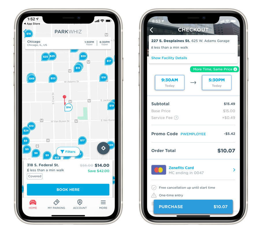
Pricing design prior to this project.
Team
Our team consisted of myself, the Lead UX designer, a UI designer, and the Product Manager for our mobile app.
The Challenge
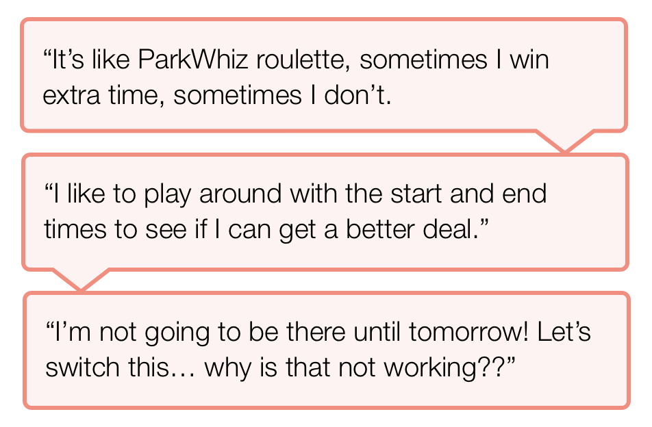
As users began to make repeat purchases and become more familiar with the software’s structure, they began to ask questions about how these rates function. Through interviews, usability testing and other channels, we received consistent feedback that users were confused by rates. Even though the business viewed ‘auto-extend’ as giving the user a freebee, users felt frustrated that their search queries were changed without their permission. We witnessed many new users assume that they had actually made an input error, and attempt to ‘correct’ the end time. Repeat users often reported tinkering with the end time in an attempt to find the best value or get extra ‘free time’.
Redesign Goals
Our goal for this project was to eliminate the black box of pricing and improve the experience for both repeat and new users alike.
Our key objectives:
Visualize prices and hours of eligibility
Take the guesswork out of using ParkWhiz
Provide more value to the user than our competitors
Process
Defined user and business goals
Users want more information about how our rates work
Users want this information early in the search process
Users want flexibility in which rate they can purchase
The business wants the opportunity to up-sell a higher rate band
The business wants increased purchase conversion
Since we already had a great sense of where and why users were struggling, the first step was meet with internal stakeholders to define user goals, business goals, and understand technical limitations. The PM and myself met multiple times with the Core Engineering Lead to fully understand what information is returned from the API with a quote request, and how that data could be transformed. Once the goals and technical landscape were defined, I moved into wireframing potential solutions.
Wireframes
First, I explored design patterns commonly used in complex pricing. Then, I began ideating solutions to meet our user and business goals.
Idea 1
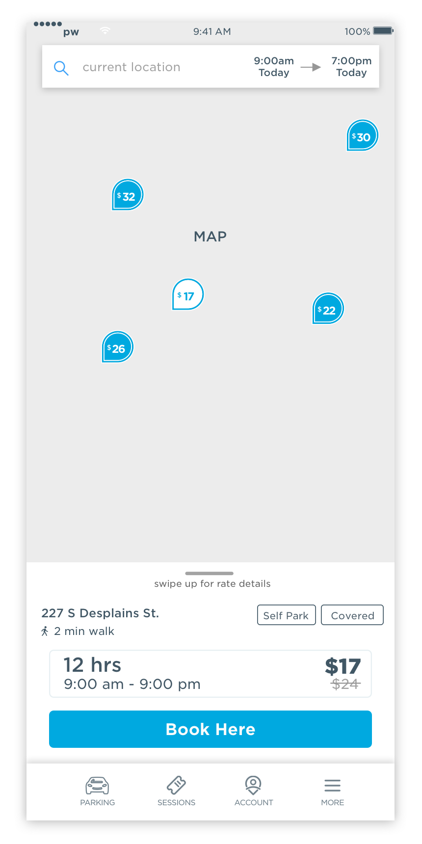
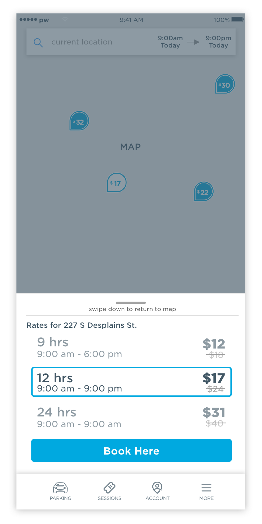
Collapsable pricing transparency on facility card
With a simple swipe interaction, the facility card expands and uses a Lightbox effect, revealing details about the 3 rate bands closest to the user’s search.
By using the Lightbox effect, we can focus the user’s attention while revealing more complex content.
A user can easily return to browsing by tapping the map, or swiping downward.
Idea 2
Pricing transparency on facility details & checkout
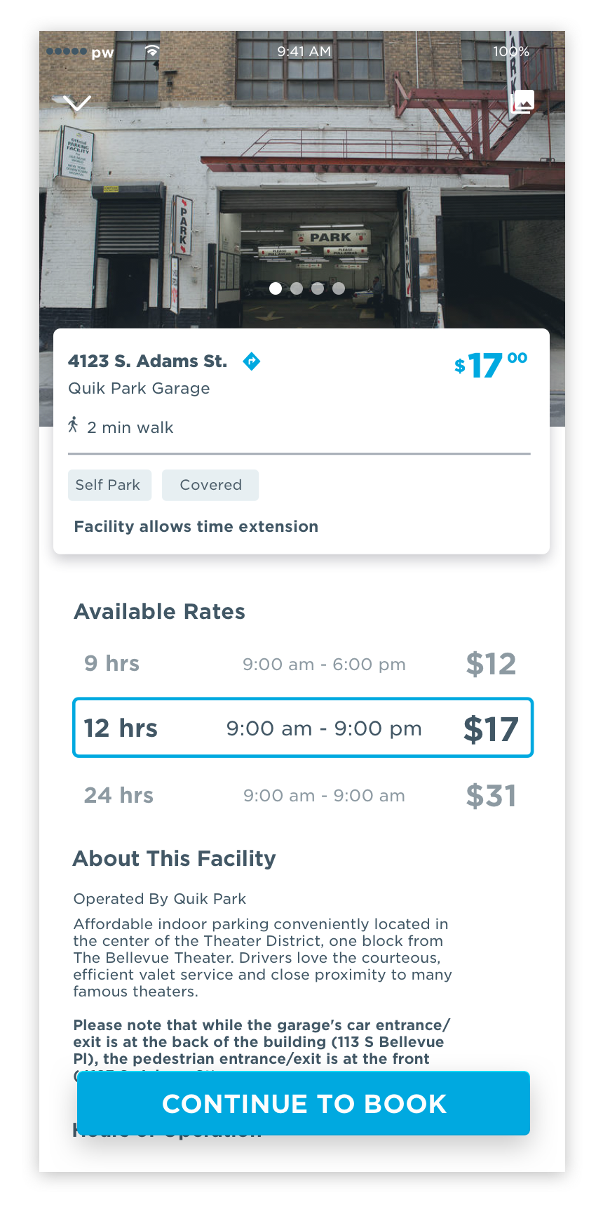
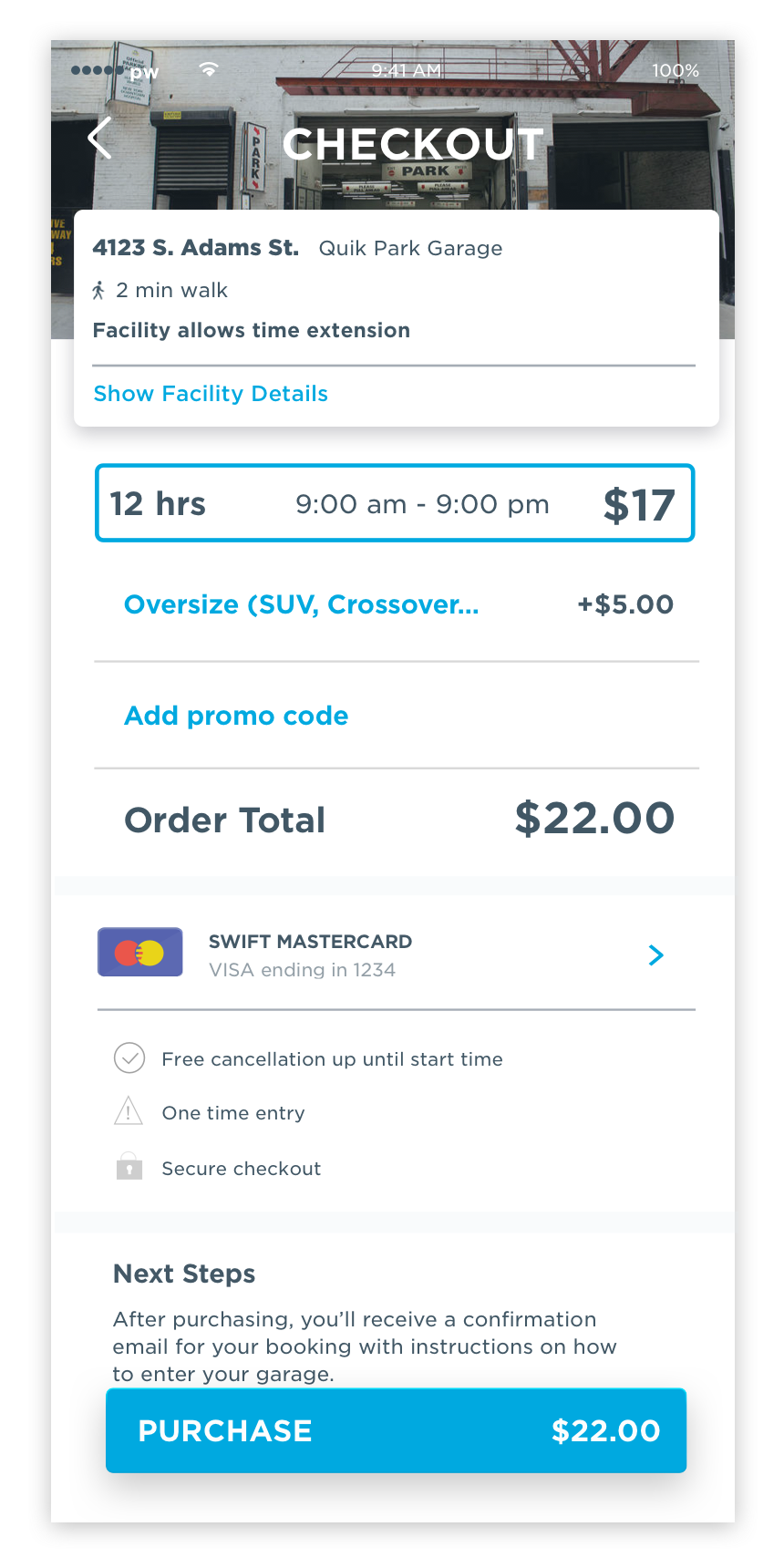
We can seamlessly integrate pricing transparency into the existing user flow by adding a new section to the ‘facility details’ page, as a user will already view this page on their way to checkout.
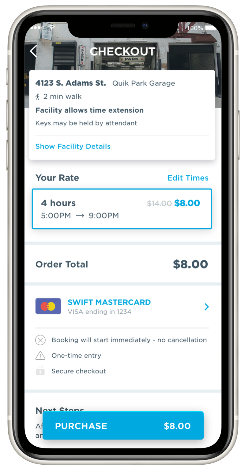
Details about the selected rate band is carried through to checkout for an enhanced understanding of how time affects the final price.
Usability Testing
Due to business restraints on idea #1, we chose to proceed with and usability test idea #2. Our goal was to ensure that rates were easy to read and understand, and to uncover any unintentional usability issues. Layouts were prototyped using Marvel App, a tool that helps make mockups clickable. We used task-based testing to evaluate user successes and failures. All sessions were recorded and completed in an unmoderated, remote user testing tool called Validately. After testing, we analyzed the results in a task matrix to quantify patterns seen throughout all sessions.
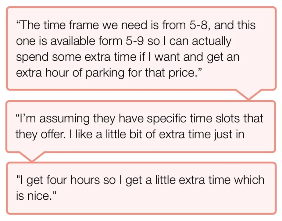
We saw a significant increase in user understanding of the relationship between time and price.
5/6 users noticed the new pricing section on the facility details page
6/6 users understood their end time was “extended” because rates are structured as bands
Through usability testing we validated that our proposed solution was superior to the current experience.
Final UI
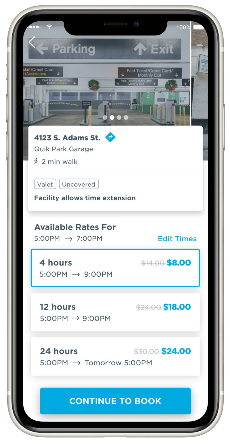
I worked closely with our UI designer to implement feedback from user testing and finalize the visuals. For instance, adding the “Edit Times” button so that users always have the option to edit their original search query.
Business Outcomes
After release, the business measured that 5.5% of users upgrade their pricing tier, resulting in a measurable increase in average sale price.