Improving Monthly Parking
Overview
In 2019, we began work to improve our purchase experience for monthly parking (i.e. paying for an entire month of parking upfront).
Team
I paired on this project with another UX designer. She focused on the first half of the purchase experience: searching, selecting a date, and browsing. I focused on the back half of the purchase experience: reviewing facility details, selecting a rate, and checkout. Other team members involved included the website Product Manager, UX supervisor, and Web Engineering Lead.
Project Goals
Understand where and why users were falling out of the purchase flow
Redesign the purchase flow to correct any issues and better support user needs
Process
Host user interviews
Benchmark usability test the current product
Define customer user journeys & opportunities for improvement
Host a design workshop
Wireframe a solution
Usability test mid-fidelity prototypes
User Interviews
I interviewed 8 people that had recently purchased monthly parking on parkwhiz.com. Through interviews, we were seeking to accomplish two things. First, to gain a deeper understanding of use cases: why does one search for and purchase monthly parking online? Second, to gather user feedback on the process of buying and redeeming monthly parking on parkwhiz.com
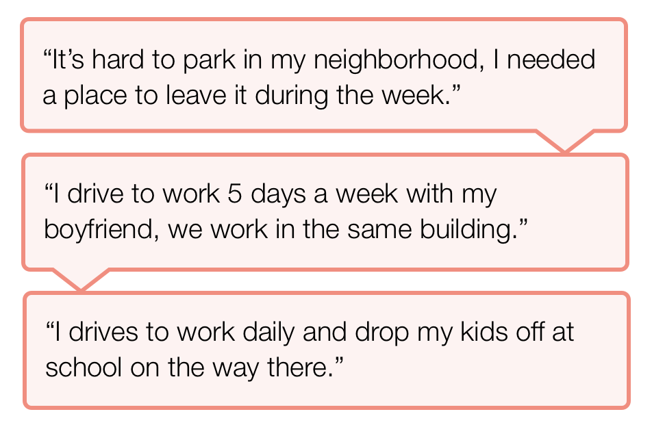
Through the interviews we discovered two main use cases:
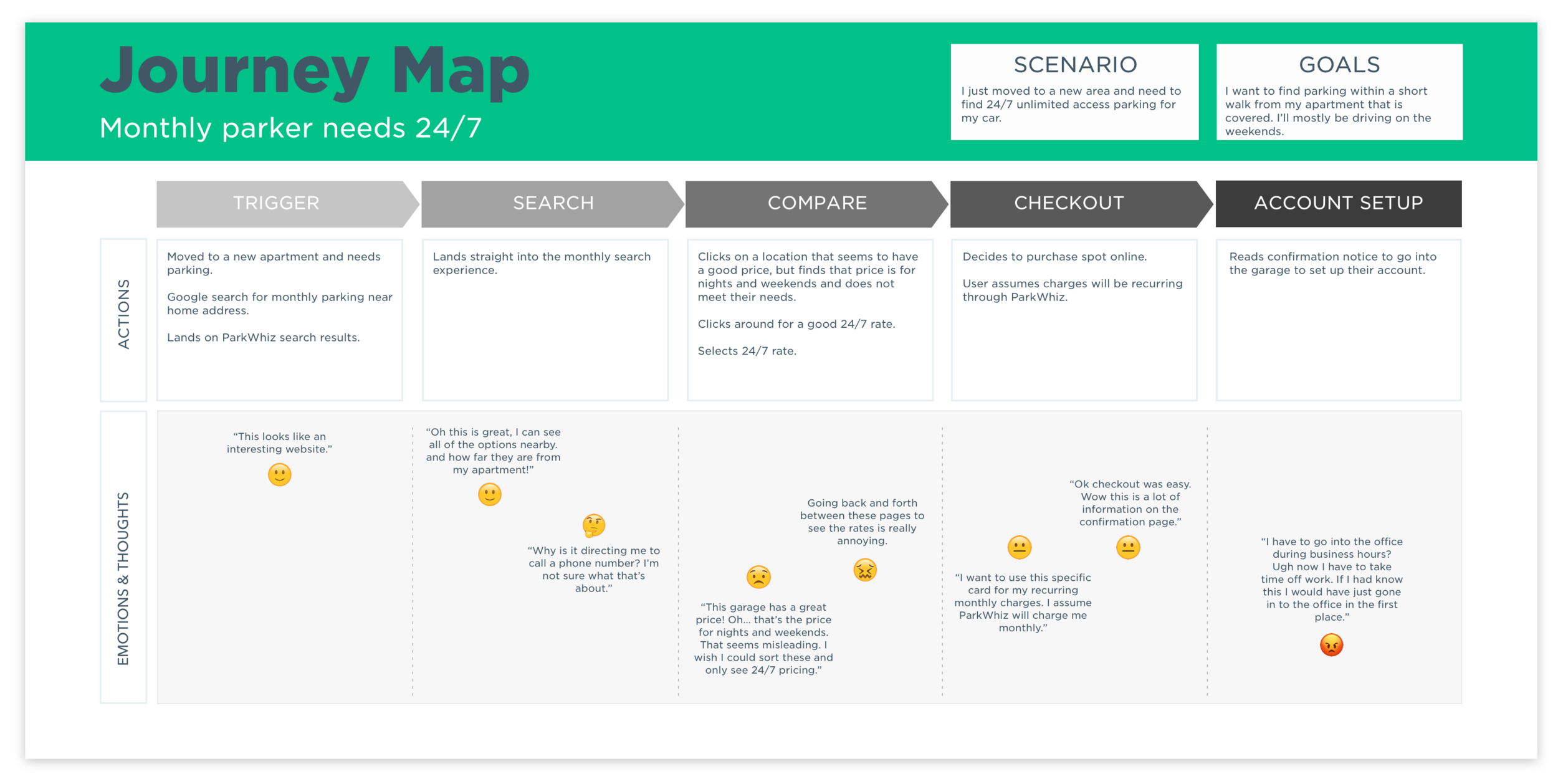
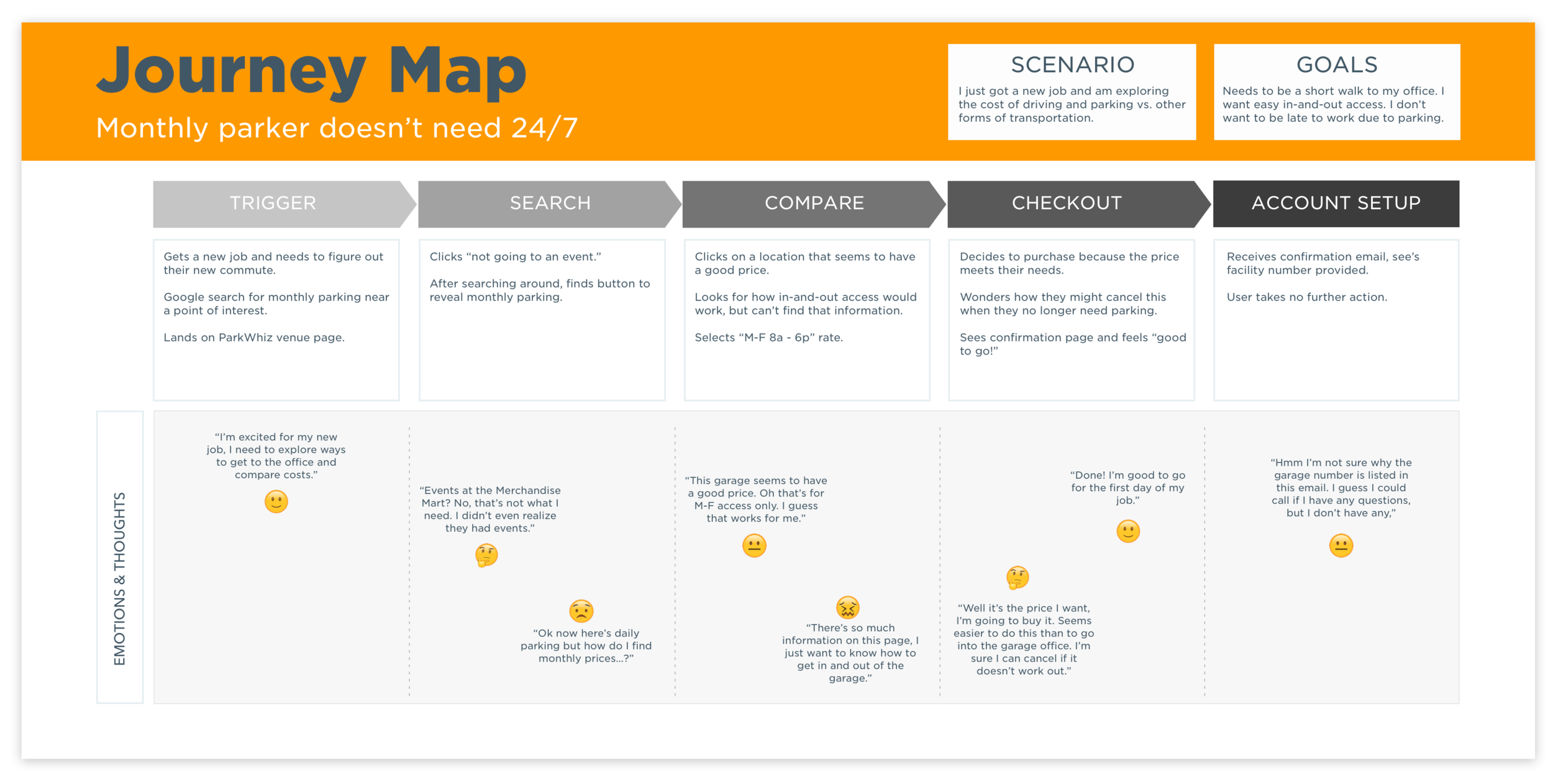
Someone looking for long term car storage. They do not use their car daily. They need 24/7 parking. This user is seeking out the best deal.
Someone who needs less than 24/7 parking. Typically, they are driving to work and need parking near their office, but only on certain days and times. While this user cares about price, they are looking for convenience and speed of entry and exit.
Benchmark Usability Testing
We conducted benchmark testing of the current experience with the goal of identifying and prioritizing the greatest usability issues. We ran unmoderated, task-based usability testing with 5 users through the online DIY testing platform, Validately.
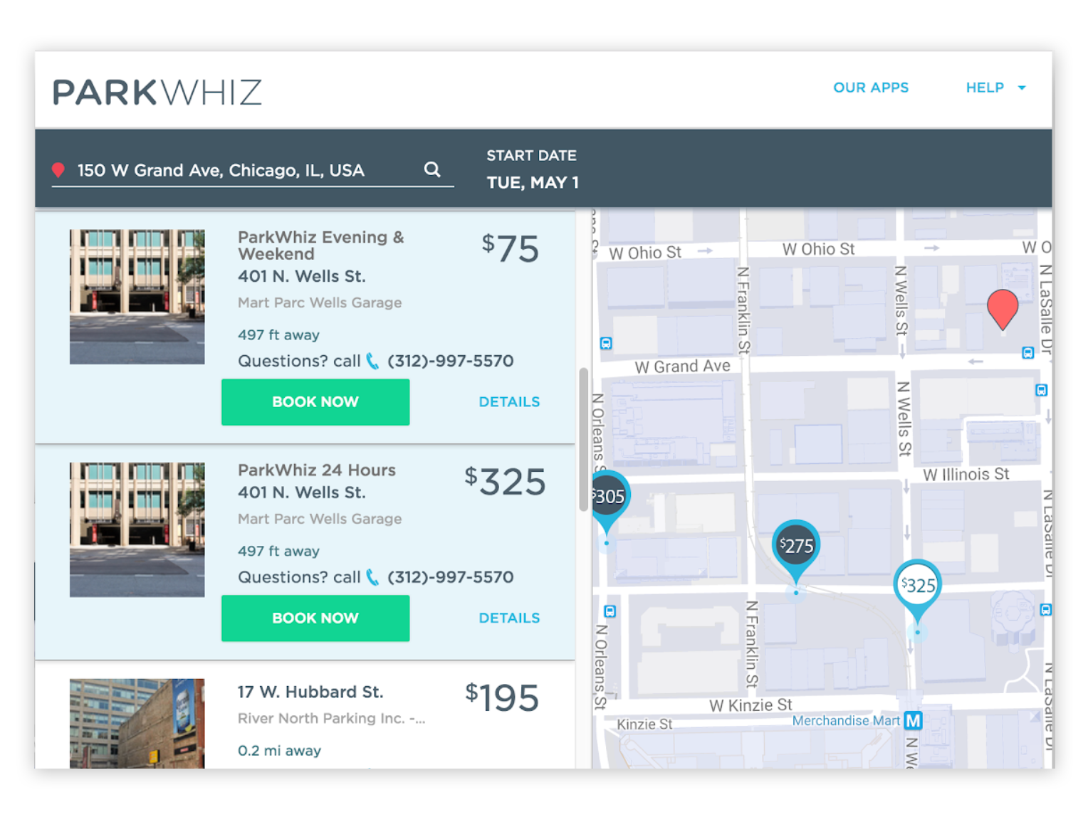
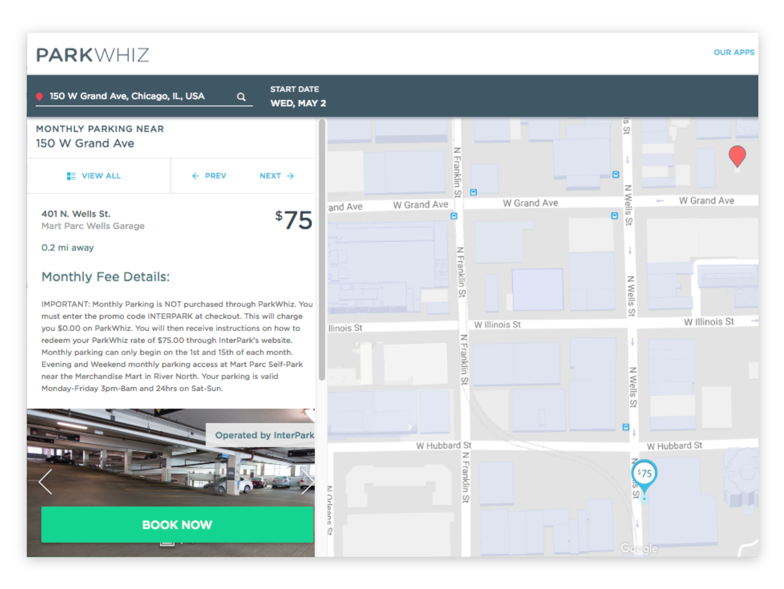
Images of the experience at time of benchmark usability testing.
Through testing we discovered two impactful issues:
The way the site presented multiple pricing options at a single facility was problematic and confusing to users.
We could improve communications about what to expect post purchase. Users guessed and made assumptions about what would happen after they completed their purchase. Uncertainty is harmful to any e-commerce experience.
User Journeys
Armed with direct feedback from real customers and data from usability testing, I created user journeys for our two main use cases:
Design Workshop
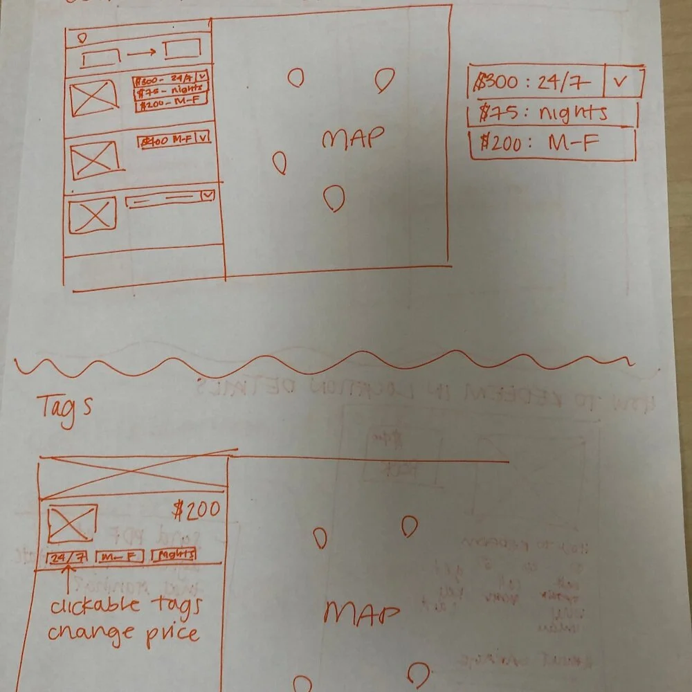
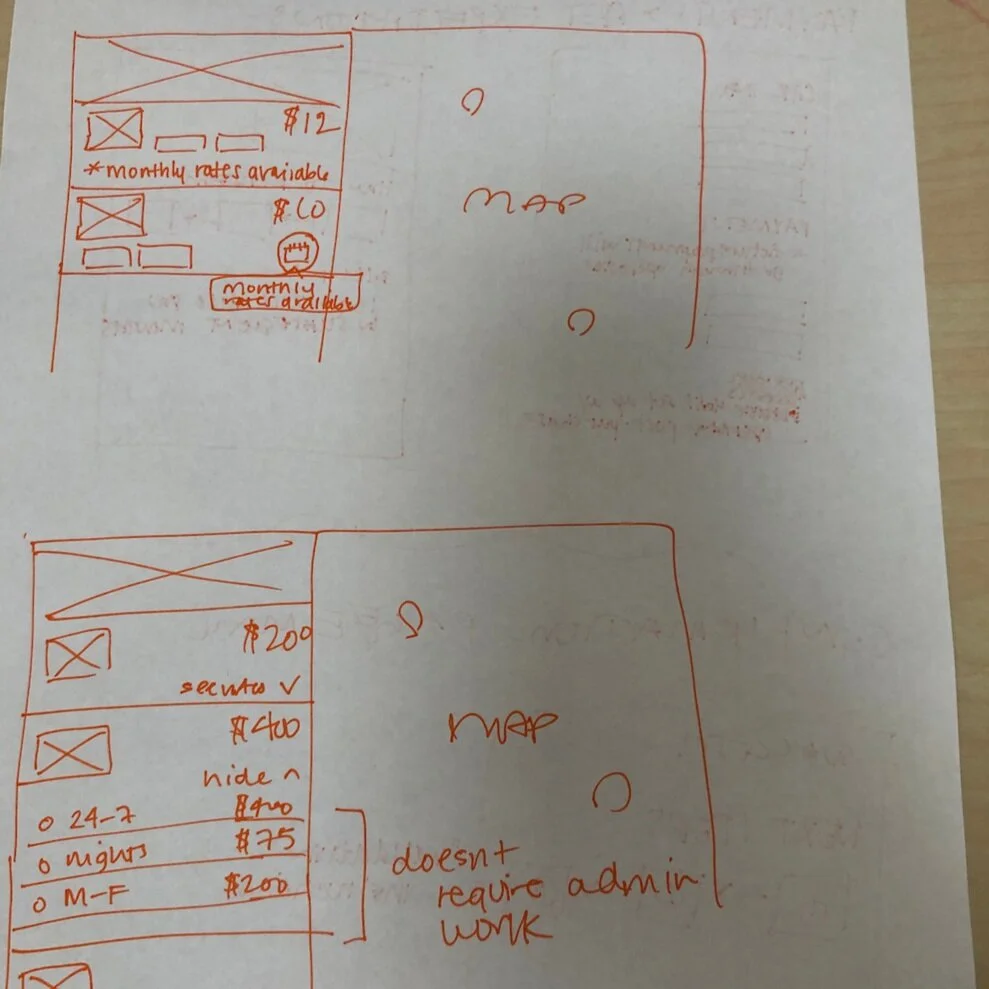
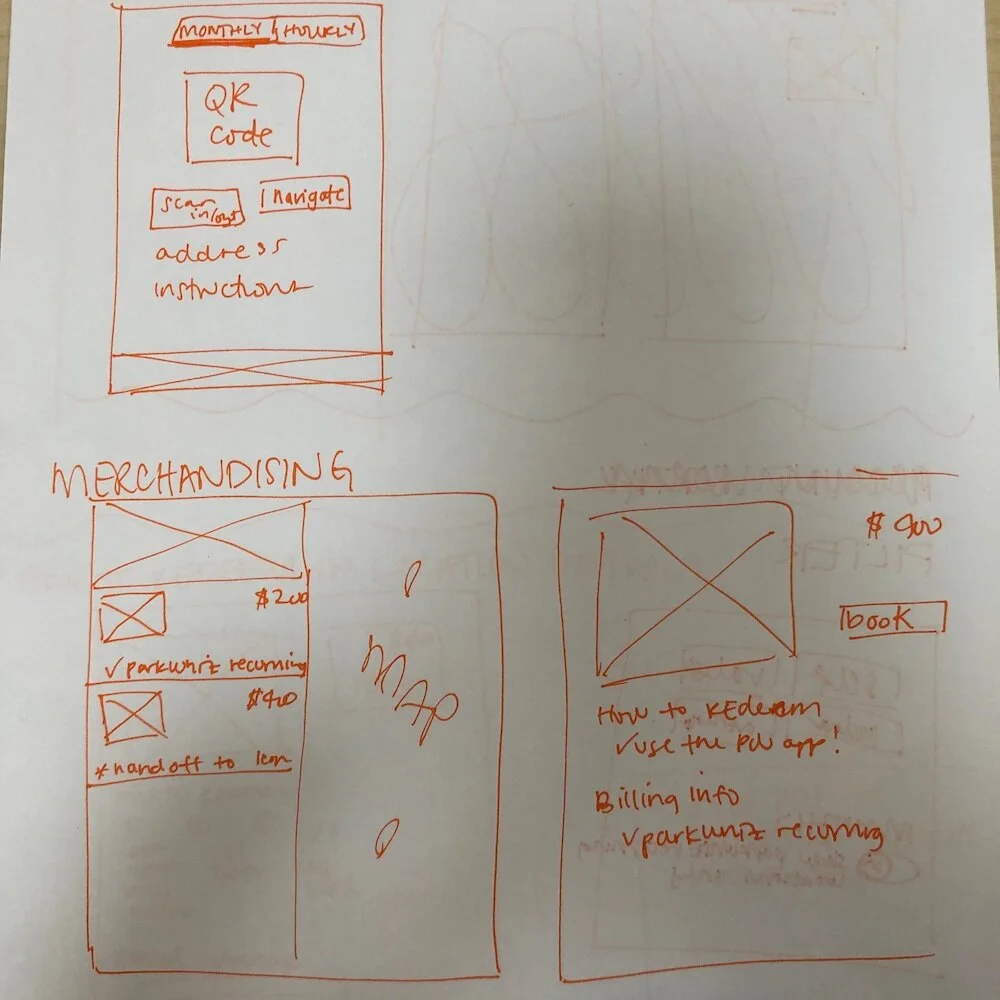
With all of this impactful knowledge, I hosted a design workshop with key stakeholders (other UX designers, Product Managers and Engineers). We reviewed the user journeys as a group before breaking into small teams for rapid ideation sessions. Each group included a moderator to document ideas and ensure all voices were heard. We had two sessions, each focused around one key question:
How can we better communicate multiple pricing options?
How can we improve setting post-purchase expectations?
Wireframing
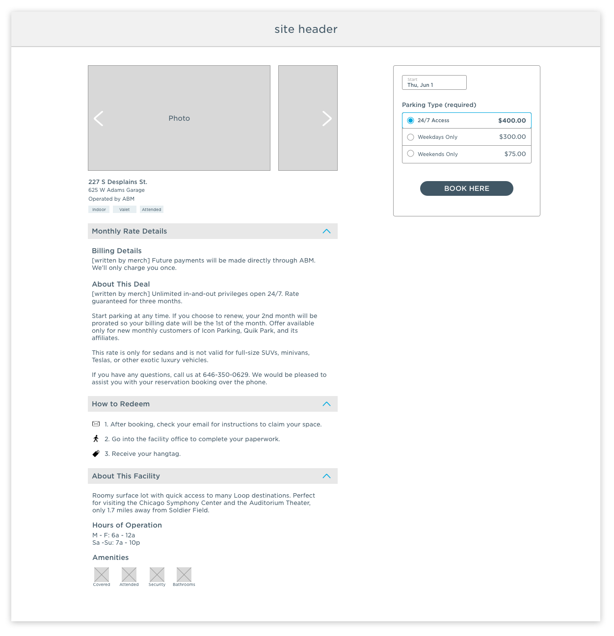
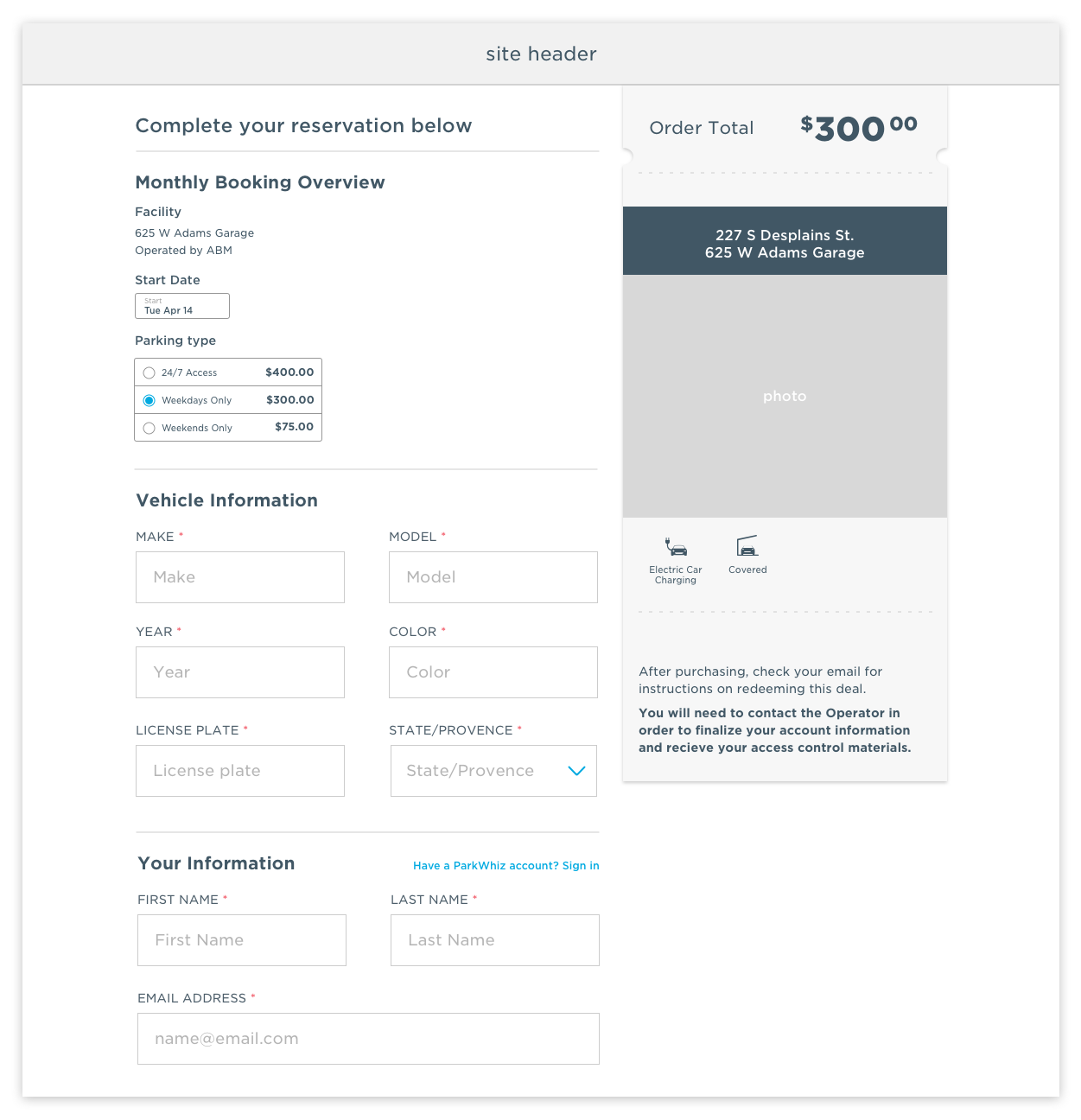
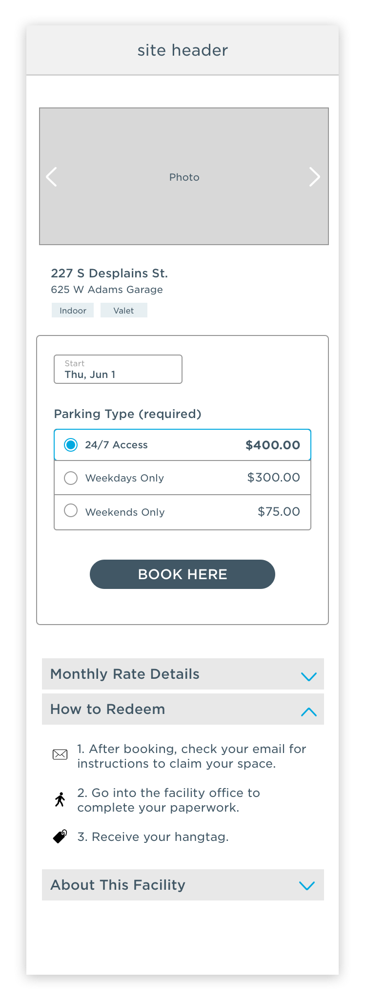
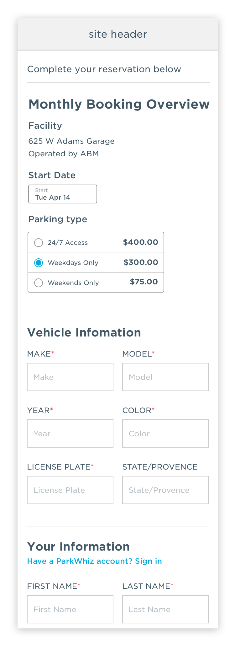
After the design workshop, I took all ideas and wireframed them out in Sketch. Flushing out full user flows made it apparent which ideas would work in context, and which should be tabled for another type of project.
As I mentioned earlier, I paired with another UX designer on this project. Since she worked on the design for the “front half” of the purchase flow (search and browse), I’m only including wireframes for the “back half” (facility details and checkout) to accurately represent my contribution. However, we did collaborate early and often on the pricing tiers, as that impacts all pages.
Usability Test Mid-Fidelity Prototype
With our wireframes, two mid-fidelity prototype were created, one for a desktop and one for mobile. Each prototype was usability tested with 6 users.

Research findings:
When asked questions about what to expect post-purchase, all 6/6 users referred back to the new “How to Redeem” section
5/6 users were able to correctly answer questions about how future billings would work, all found and read the new “Monthly Rate Details” section
While all users eventually found the available rates on the Facility Details page, 5/6 did look for this information on the map/list page
Despite the successes of the usability test, unforeseen business needs paused this project before it could be implemented.